Reviewing the worst and best Pride collections
June 3, 2021
‘Tis the season for corporations to release their Pride collections, showing support for queer lifestyles now that they’ve been federally legalized and are socially acceptable! Some LGBTQ+ individuals enjoy this trend as they feel represented by the products and mainstream attention. Others find “rainbow capitalism” damaging to actual queer liberation and see it as commodifying the struggle.
Here’s a ranking of some of the worst and best Pride collections that I’ve seen. Now admittedly, it’s a feat to slap a rainbow on an article of clothing and have it turn out wearable, but where some of these companies met the mark, some definitely missed it.
The Worst:
What does this even mean? I stare at this top and I’m just confused because the design is so messy. The bold, the gradient… it’s all a mess.
Target: 1/5
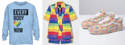
This is just the epitome of awful. It’s as if they took a pride flag and sewed sleeves on it. It’s such a trainwreck that I just can’t look away from it.
Vans: 2/5
These shoes should come with a photosensitive warning. They’re taxing to look at in more ways than one and I really don’t know how this pattern got approved. Most of the colors and patterns in this product line are complete eyesores.
The Best:
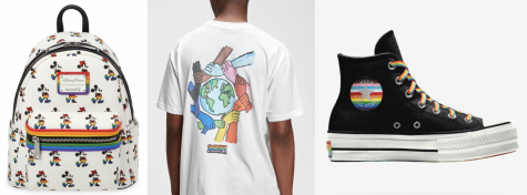
Ok, I actually like this collection. A lot of these rainbows are a lot more subtle or well-placed. Some of these products are actually really cute and are things I would wear.
Gap: 4/5
Gap wins for me when it comes to original designs that are actually wearable. Their line is soft and quite aesthetically pleasing.
Converse: 5/5
This whole line is fully customizable and includes a huge variety of flags and designs. I really like how these look and everything feels intentional and respectful.